
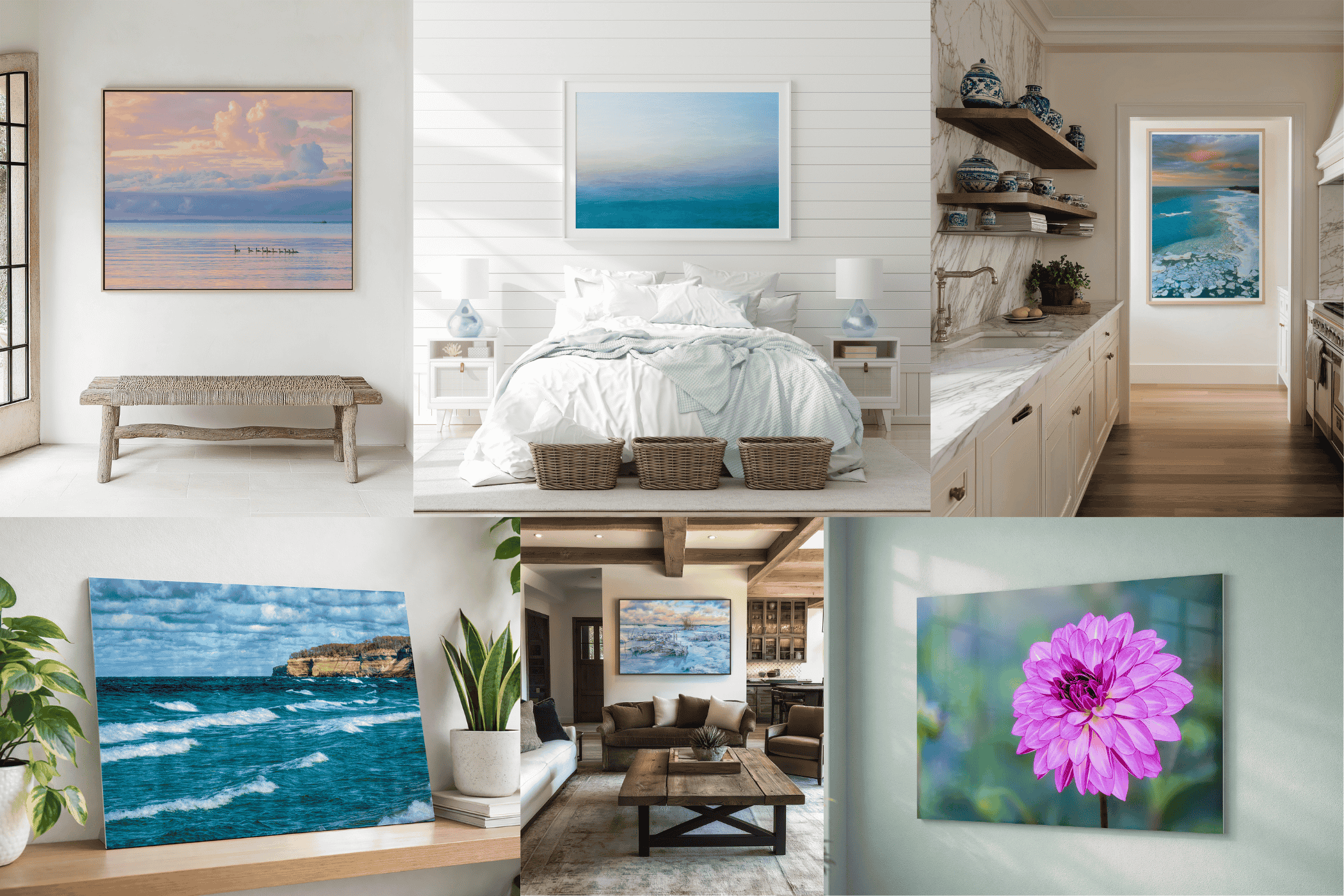
Where and how to choose wall art, in particular, fine art photography for our home? Many options are available to us. This includes social media, art websites, art galleries, interior decorators, in person shopping venues? Are these viable? Yes to all!
Let’s back up just a bit. Many times our ideas for art happen online, especially social. When we see a stunning, bold and saturated photograph or other art piece on social media, it’s grabs our attention for a split second, maybe two. We look, we like, then, we save or simply move on. Dopamine hits are quite common and quite enjoyable for many of us on social in particular.
When we bring fine art into our home, that image has to do something much more difficult than look good on a screen. The art we choose needs to live with us in a way that feels good. Every day.
Art in our living spaces sets the tone, creates a sense of place.
When it comes to the art you buy – it is your personal choice. All of us enjoy different styles – from uniformity across rooms in the home, to rooms with their own vibe. What matters in your home is how the art you select makes you feel.
How to choose wall art that reflects your own unique and wonderful style

Art serves as an anchor for our mood and a mirror of our own style. Our selections and placements add comfort, energy, visual interest. And yes, they even serve as a little happy place for a mental escape.
“What catches my eye in a moment – on social, in a gallery, on an art site – isn’t always what I want to live with every day. In my home, the art selection needs to reflect the DNA of my decor, how I want to feel in a given room and add depth and interest.”
Sheen Watkins
Choosing the right piece isn’t just about the subject or media. The right selection is about how the color application, texture, and emotional energy interacts with our daily life.
Whether drawn to the joy and intensity of Wildlife, the vastness of Landscapes, the delicate details of Flowers, or the fluid energy of Abstracts in Nature, each piece we choose is a reflection of us. What we enjoy, what ignites our feelings serve as starting points for what works in our space. This applies to all of our art choices in addition to photography too.
We’ll start with a consideration on color. Then, we’ll expand on selecting art.
Color Saturation vs. Artistic Application
Today, there is a common trend in digital photography on social and online in general: over-saturation. There is a massive difference between saturated color and balanced application. We’ve all seen those images where every pixel is screaming—a neon red sky glowing across purple snow. While it appears striking on social media to many, these can feel loud, chaotic and exhausting in a personal, living space.
Note: Use of color and saturation is a reflection of the individual artists’ style. Their work of a given image may also look different on their website vs. social. It is up to the artist to chose pushing the saturation sliders, using white balance as a creative tool or fine tuning colors in isolation.

True fine art relies on color application not just saturation. This means that even in Vibrant & Colorful or Pastel piece, there is visual relief.
When choosing works of art, consider:
- Balance: Does the warm fight with the cool tones? Is there sense of place that the use of color (or lack of color) creates? Or, does an overall cool tone or overall warm tone offer your room the balance you’re seeking?
- Where does your eye land: Is the hero color allowed shine without overwhelming the room. Does the focal point draw the eye in to the moment?
- The Guiding Principal: When an image has areas of rest, the focal point becomes a discovery, not a demand.
How to Choose Wall Art that Reflects Our Personal Style and Vibe – The Energy Target?
Selecting art is more than just matching a rug, sofa or wall color. It’s deciding how you want to feel when you cross the threshold of a room. Since fine art photography captures a specific moment in time, it sometimes carries a temperature that potentially shifts the room’s atmosphere. Or, it may complement or blend in to the vibe you’re creating with mixed media art selections.
When curating a space, we often think about the “what” (the subject), but the “how & where” (the composition) is what dictates the energy. Plus, take into account how the presentation of your art, framing, material flows with the art and your space. I reached out to the highly rated CaptureOn Labs, specializing in fine art prints and custom framing for their perspective.
People often choose wall art based on colors, décor and trends, but the strongest collections start with personal connection. Choose artwork that reflects your experiences, passions, and memories. The right frame and mat combination can tie it into a space, but the artwork itself should be what speaks first.
David Schockey, CaptureOn Labs
Emotional Weight and Visual Breathing Room
Selecting art for cohesion starts with respecting the sense of place. Consider the architectural DNA of your home, the location, the design or designs throughout. While art is a place for personal expression, it should feel like it was born in the house, not just hung there.
The Loud vs. Quiet Balance: If your room is filled with books, textiles, and patterns, a low-key piece—like a minimalist Abstract (seen Below), soothing Landscape or a soft-focus Flower—provides a visual exhale.

The Power of Scale: Leverage large-scale photography. A single, expansive wildlife portrait can actually make a small room feel larger with more depth by creating a window effect. Conversely, a gallery wall of many small pieces on a big wall can sometimes feel cluttered, shrinking the room.

Small Spaces: The areas where I use smaller pieces combined are in smaller, narrower spaces. In some cases I stack art vertically to give height or I may stack two and put one on the side.

Decor Styles
The Cozy/Craftsman or Farmhouse: These homes crave the Grounded & Steady energy of high-texture Wildlife, and warm, cozy tones. The rich, organic details of a Great Gray Owl (above) or a deep-toned sunset (below) feel at home among wood grains and stonework, whereas a neon-bright, ultra-modern abstract might feel like an intrusion in a tactile, earthy space. The flying owl above adds a sense of energy while the sunset below evokes calm – both work in the same space.

The Modern/Minimalist Open Plan: In a high-ceilinged, airy space or with, visual breathing room is your best friend.
A Moody & Dramatic Aurora Borealis as seen below or a crisp, Abstract in Nature maintains that sense of expansion. You would likely avoid a rustic, barn print here, as the heavy nostalgia of the subject might clash with the forward-looking energy of the architecture.

The Industrial/Urban Loft: Playing with contrasts elevates energy and warmth. The softness of a pastel flower or bold, vibrant flower may provide a counterpoint to cold concrete and exposed brick. It becomes a or the living element in a structured environment.

Using of Mixed Media Work with Fine Art Photography
One of the most common questions I hear is whether photography works with other types of art. The answer is a resounding yes. In fact, photographic fine art often acts as the grounding element in a mixed-media gallery.
The Moment of Truth: In a room filled with abstract paintings, textile art, or sketches, a crisp, fine-art photograph provides a moment of truth. It offers the room with a touch of reality.
Layering Textures: Try pairing a high-texture Neutral photograph of a Great Gray Owl next to a coarse woven wall hanging or a ceramic sculpture. The lens captures details—the feathers, the catchlight of the golden eyes — that complement the tactile materials in your home, creating a cohesive, curated look that feels professional and intentional.
Being Intentional to the Vibe of your Room
My recent and evolving fine art photography website, Sheen Watkins Collection, is designed for personal home owners looking for art, interior decorators and curators. While I’m adding work each week, I have created two approaches to looking at art thus far. The traditional categories of Landscapes (including aerial), Wildlife, Abstracts and Flowers are available. However, today we tend to acquire our art based on a desired atmosphere, story or vibe.
- The Power of Neutrals: Creates a tonal look that deepens your decor with organic texture and calm. These pieces don’t compete with your decor; they deepen it, adding organic texture and a sense of calm without breaking the palette.
- The Softness of Pastels: Offers a gentle wash of color for a restful, airy feeling. Soft light and blurred lines provide a restful, airy feeling that invites a lower heart rate.

- The Energy of Vibrant & Colorful: Acts as a conversation starter, creates a statement and a visual exclamation point.
- The Depth of Moody & Dramatic: Creates a room that feels sophisticated, intimate, or even a bit mysterious. These pieces “recede” into the wall, creating an illusion of infinite depth and a sense of wonder.
All of the above work with mixed media or standalone.
How to Choose Wall Art to Impact Dimensions of Space
Beyond color and category, the subject defines how our eyes move through a room. Fine art photography offers the ability to change the perceived dimensions of a space.
- Wildlife & The Intense Gaze: Wildlife brings an alive with you energy. An owl facing directly toward the viewer with an intense golden gaze creates a powerful, immersive connection. These pieces work best where you want to feel a sense of presence and focus.

- Landscapes as Windows: These provide literal “breathing room.” If you have a small room or a space without many windows, a vast Michigan landscape can visually open up the room and walls to provide a sense of scale and infinite horizon.

- Abstracts & Flowers for Intimacy: These are about emotion and internal reflection. Because they are less about a place and more about a feeling, they allow the viewer to project their own mood onto the art. This makes them perfect for personal spaces like a home office, bedroom or a reading nook.

For Darker Spaces
- Create a Visual Anchor in Darker Rooms: Many people think you need light art for dark walls. Actually, a Moody & Dramatic piece on a dark-toned wall (navy, charcoal, or forest green) creates a seamless, high-end “gallery” feel. The art becomes a window into the night sky rather than a bright spot that breaks the flow.
- Texture in the Dark: In our darker-toned sunsets or Aurora shots, look for the subtle textures in the shadows. These pieces work beautifully when paired with mixed media like metallic accents (gold or copper frames) or printed on metal, as the dark tones of the photography make the metal “pop.”
- The Evening Bloom: Moody art is a shape-shifter. In the bright afternoon, a night sky photo might look like a deep, dark abstract. But as the sun sets and your indoor lamps turn on, the rich colors of the Aurora or the sunset begin to bloom, changing the mood of the room from productive to reflective.

Lighting: The Living Element
Fine art photography is often printed on Giclée, gallery quality papers, metals or canvases. Each media reacts a bit differently to your home’s lighting throughout the day. This is the ultimate anti-social media experience; the art changes as the light moves.
Reflecting the Light: Unlike a backlit phone screen, physical art relies on reflected light. When placing a piece from my or any collection, consider how the natural light hits the wall. A piece with visual relief (as mentioned in the Color Saturation section above) will maintain its integrity even in direct sunlight, whereas over-saturated digital prints may appear plastic or harsh.
The Blue Hour Effect on Your Art: Just as I capture images during the Blue and Golden Hours, these pieces bloom differently depending on your light. A photograph with deep shadows and subtle highlights reveals new details at dusk that weren’t visible with bright light at noon.
Curating your home with art is a process: This is much like the patience required to capture a rare wildlife encounter or the perfect sunrise. Finding what works, what feels good happens over time. As you explore the galleries at Sheen Watkins Fine Art Collection or other artists websites/shops, look beyond the initial ‘click’ of recognition.
Ask yourself for a given space, “How will this color settle into my (morning coffee, evening relaxation, family gathering) routine? How will this image look under my (examples: evening lamps, light through the window, dark corner, over my desk)? Choose the art that doesn’t just grab your attention, but reflects your intended style and vibe and makes you feel they way you want the room to feel.
Authors Note:
Whether you are drawn to the mystery of the woods or the quiet curve of a petal, remember that your home is your own private gallery. By choosing art based on your tastes in color application and emotional energy rather than social media trends, you create a space that doesn’t just look good for a second—it feels good for a lifetime.
Explore the Collections:
Ready to find your match? Shop our curated galleries by category or color:
- [Shop Landscapes] | [Shop Wildlife] | [Shop Flowers] | [Shop Abstracts]
- [Shop Neutrals] | [Shop Pastels] | [Shop Vibrant & Colorful] [Moody & Dramatic]
